News & Updates
Using “HotSwapAgent” fot hot deployment during development
From beginning on CaptainCasa
Learn More »We believe that
User Interfaces are key to your successful application
If something is well constructed, it looks clean, structured and beautiful.


CaptainCasa Enterprise Client
CaptainCasa Enterprise Client is a web front-end platform for demanding, long term oriented business and industry applications. It enables you to develop highly interactive web applications – without the need to learn JavaScript or any other browser technology. Server-side Java is all you need to know.
Java only development
No JavaScript, no client side coding, no assembling of HTML/CSS. - Server-side Java, that's it.
Development efficiency
Design your frontend by using a graphical editor. Directly bind your server-side application logic. Use Java for the "if-then-else"-parts and for dynamically created front-end parts.
Structured front-end
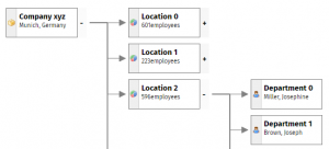
Automatically develop a highly structured UI - and no nightmare of scripting-code. Each part of your front-end is a re-usable unit to live in other parts.
Long term lifecycle support
We know that your application's lifecycle may easily last longer than 15 years! And we know how to save you investments.
Boring stuff "built in"
Multi language, multi date formats, timezone management, different styles for different users, personalized grids, ... - yes, included!
Excellent Performance
CaptainCasa Enterprise Client is designed to serve operationally used applications - and meets the user expectations towards speed and stability.
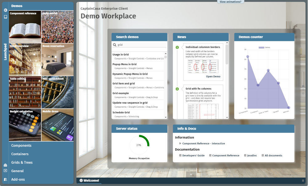
Check out the demo server...
Our ONLINE DEMO SERVER provides “tons of demos” – from presenting individual controls up to providing application scenarios.
...or install locally and get into it!
INSTALLATION is very simple and you get everything: the demo server, the development tools: you can jump-start into developing your first application dialogs!
Download & Install
3 minutes (Windows), 5 minutes (Linux, MacOS)
View demos locally
10 minutes
Start development
View tutorials 15 minutes - and go!
Enterprise Client in use
CaptainCasa is not an anonymous supplier of its framework but is your partner for user interface issues. Your feedback flows back into development. Join the CAPTAINCASA COMMUNITY and receive quick reactions on requests you might have during development.


