
All controls that are listed here – and more… – are part of the online demo workplace. Please directly test-drive the controls there!
Basic controls
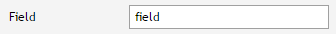
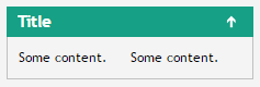
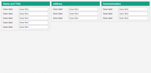
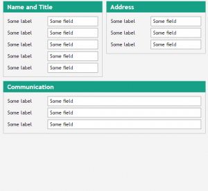
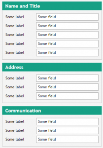
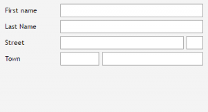
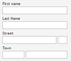
Field
- flexible background styling by application
- mandatory/error management
- maximal input length definition
- check of input against regular expressions
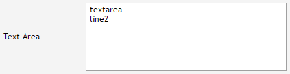
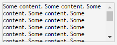
Multi line field / Text area
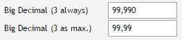
Formatted field
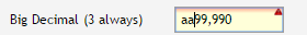
- automated formatting according to localization
- automated check of input, no acceptance of wrong values
- data types: integer, number, date, time
- localization (country/language) explicitly define-able
Password
- optional SHA encryption
Field with popup support
- optical comes as field, styled as combobox
- possibility to attach application defined popup management and attach explicitly defined dialogs
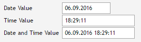
Calendar field
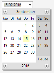
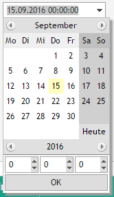
- with/without time definition
Combo box
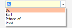
- static/dynamic definition of items
- editable/non-editable
- flexible background styling by application
- mandatory/error management
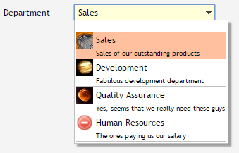
- single line/double line item definitions
List
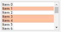
- single / multiple selection
Checkbox
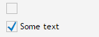
- with / without text
- triple state (true/false – undefined)
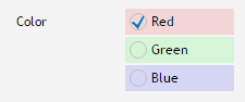
Radio button
Spinner
- from/to definition
- scrolling via icons / mouse wheel / up/down-keys
Long text field
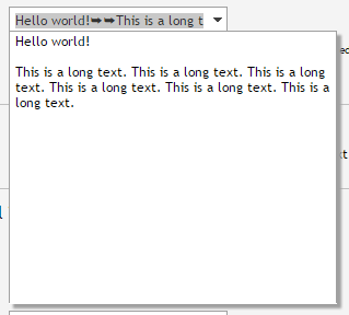
- field with option to edit the multi-line content in some popup
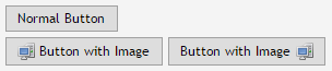
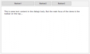
Button / Icon
Link
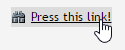
- with/without image
Awesome font icon
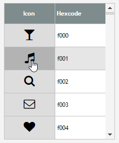
- icon image defined by reference to character that is rendered with “awesome font”
Menu bar / menu / menu items
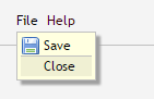
- any number of hierarchies
- with/without icon
- optional separators between items
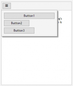
Button menu
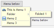
- button opens up assicuated menu
Popup menu
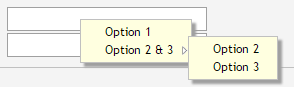
- menu that pops up on right mouse button
Simple HTML Editor
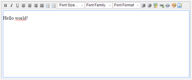
- direct editing of HTML content via simpe editor
- based on nicedit-editor project
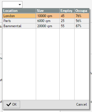
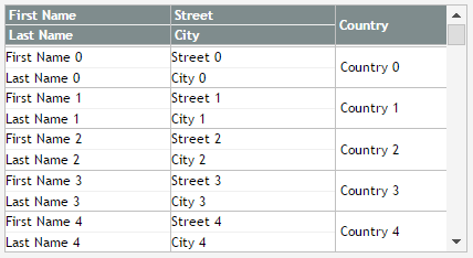
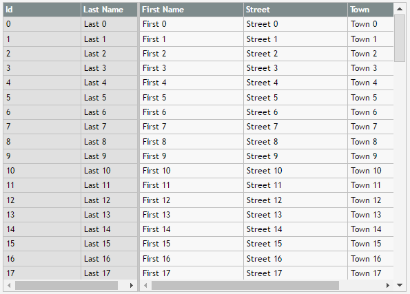
Grid controls
Basic Grid Features
- any control (field, label, button, …) usable as cell control
- intelligent scrolling on huge amount of data items
- single / multiple item selection
- column sorting (single column, multiple columns)
- drag/drop update of column sequence and column width
- optional persistence of column sequence, sorting and sizing
Header and footer
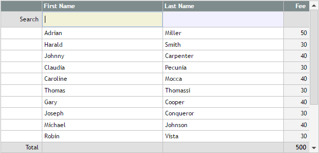
- any number of header / footer lines
Additional controls in column header
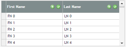
Double (triple, …) line definitions
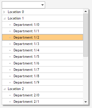
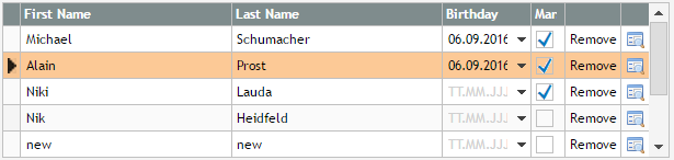
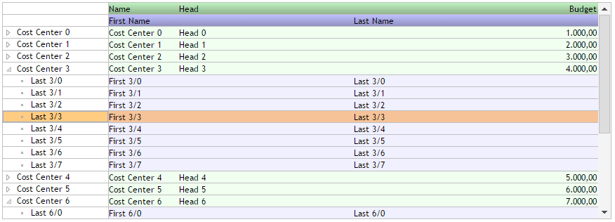
Tree
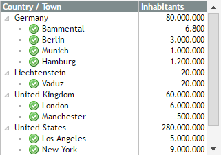
- combine-able with any number of addtional columns
- lazy loading
- hot keys for keyboard navigation (cursor keys)
- configure-able icons
- optional additional control as part of tree node (e.g. checkbox or any other control)
Fix column definition
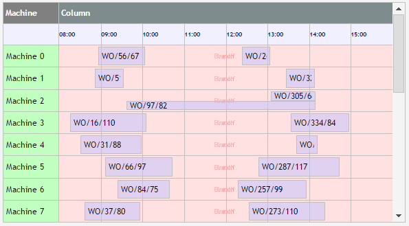
Example: schedule grid
Example: tree with column structure that depends on the type of item
Layout / Container Controls
Pane container
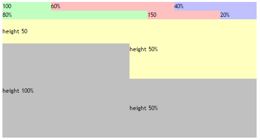
- container nest-able without any limits
- consistent sizing rules for horizontal and vertical sizing
- no size: control occupies space that it requires (minimum size)
- fix size: control receives explicit height or width definition
- percentage size: control is sized according to available space – and its own minimum size
Scroll container
- explicit definition of scroll policies
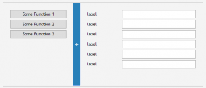
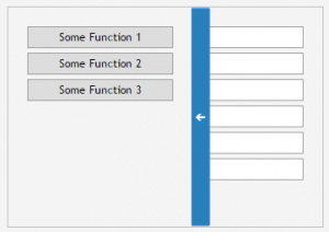
Split container
- horizontal / vertical
Fold-able / Titled container
- customize-able header components
- folding status control-able by application
- lazy loading
Tab container
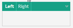
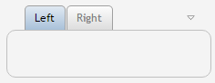
- navigation between multiple sub-containers
- navigation via tab-buttons or via menu icon
Stacked / Layered pane
- two (or more) containers sharing same space on different z-layers
Adaptive containers
Adaptive areas
- subcontent arranged following defined sizing rules
- example:
- wide
- normal
- narrow
- wide
- definitions NOT depending on device/screen size but on available space for the component
Flexible row/column arrangement
- content is arranged in rows / columns
- number of rows / columns depends on number and size of content items
- example (row arrangement)
- wide
- narrow
- wide
Adaptive line
- content of line is split into two lines
- wide
- narrow
- wide
Adaptive header
- header content arranged in header line – if available space is sufficient. Otherwise content is made available by popup
- wide
- narrow
- wide
Adaptive navigation bar
- bar is visible at side / top of content – either in parallel or overlayed
- wide
- narrow
- wide
Special components
Accordion
Dashboard
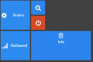
- Drag/drop of content items
- Change of content item size (small, medium, wide, big)
- Any content item (not only button)
- Optional: automated persisting of positions and sizes
Tab line
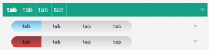
- different styles
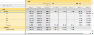
Pivot grid
Integration components
Open Street Map (OSM)
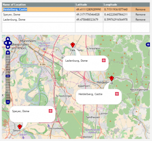
- positioning on defined coordinate
- definition of markers
Chart.js
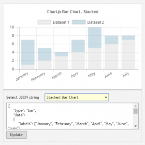
- flexible passing of “any” chart information
- adaptation to available space