There are couple of principles and components within CaptainCasa Enterprise Client RISC that are designed to support responsive/adaptive design.
First of all:
- All components in CaptainCasa can either be sized in a fix way (“100”) or in a percentage way (“50%”). You can mix both ways without restrictions. This principle is consistent through all nesting levels of your component tree, and especially it is consistent both in horizontal and vertical direction.
- All adaptive/responsive components are not depending their internal sizing from the screen size or from the media type of the browser – but purely adapt their internal sizing according to the screen space they receive as component. This means: the adaptive concepts are not bound to a certain device type but they are available “everywhere”: if an adaptive component is started in a small popup-dialog then the component arranges its content in the same way as if it was started on a small device.
- You can scale the CaptainCasa dialog in any way by passing a “&ccscale=…” parameter to the URL that opens up the dialog.
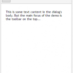
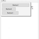
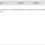
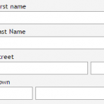
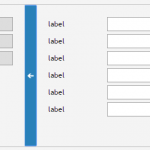
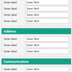
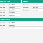
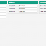
Some of the components that are explicilty designed to support repsonsive/adaptive scenarios are listed in the following gallery:

