We added some new demos to the demo workplace showing how layouts can flexibly adapt to their available screen space.
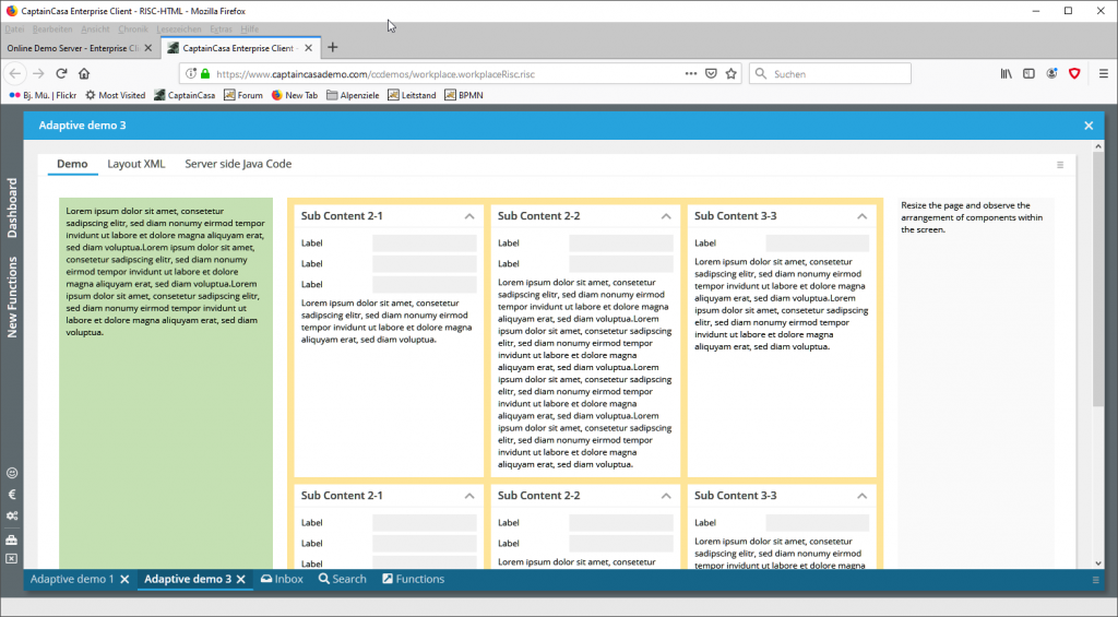
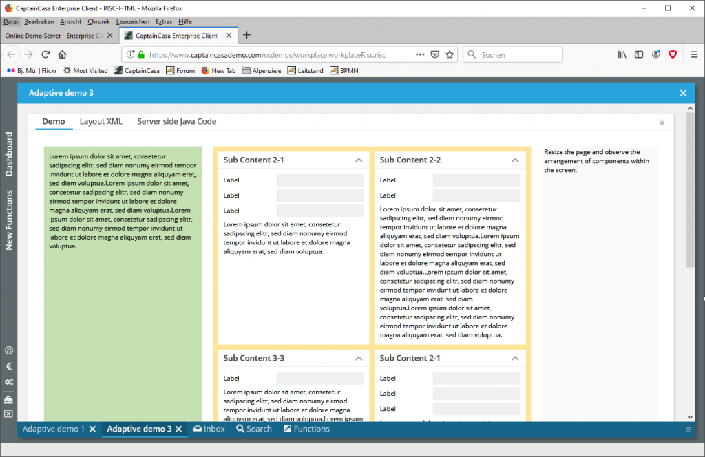
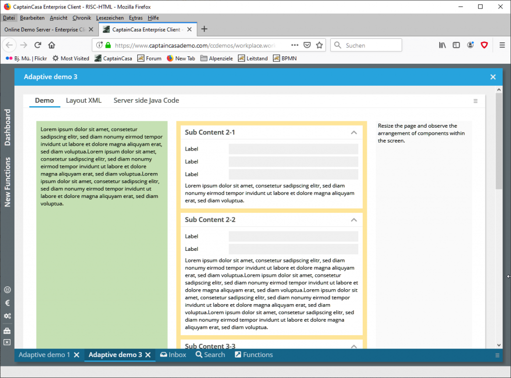
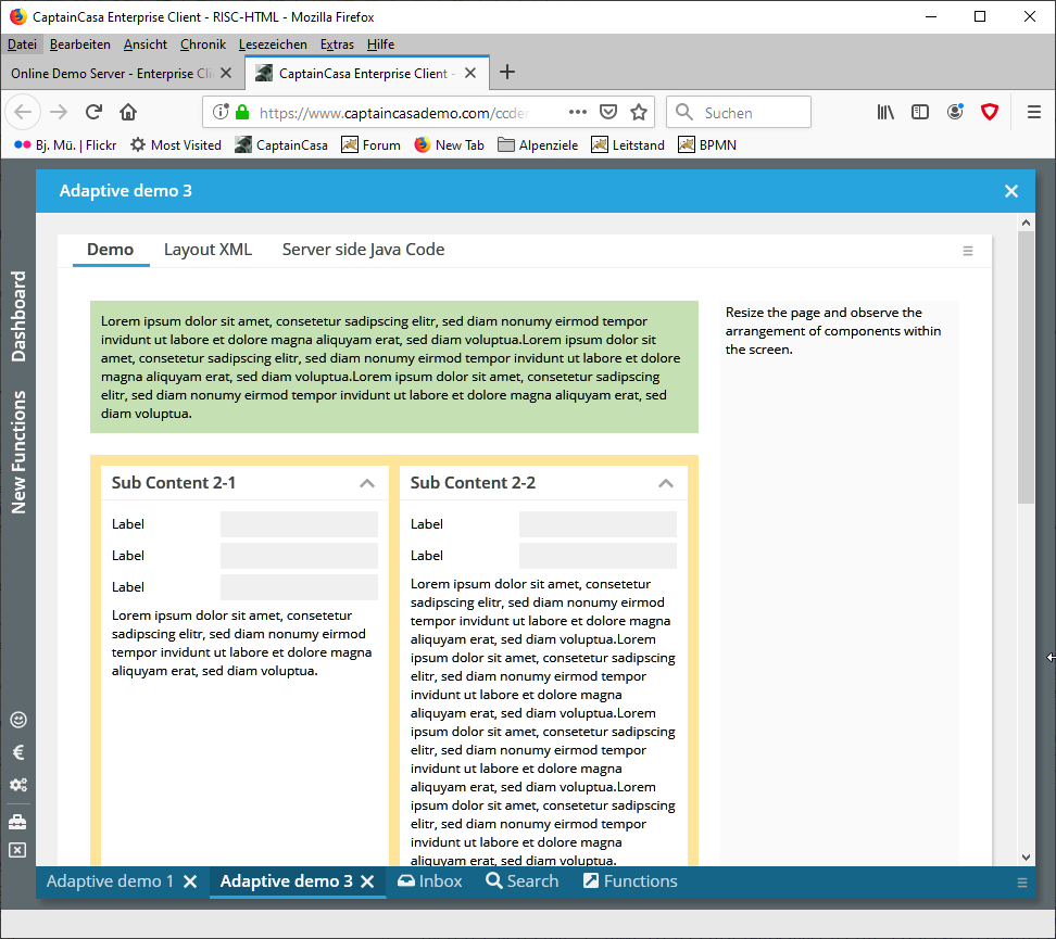
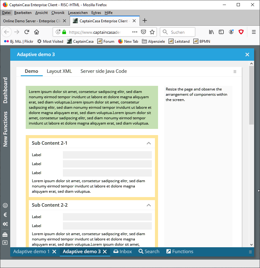
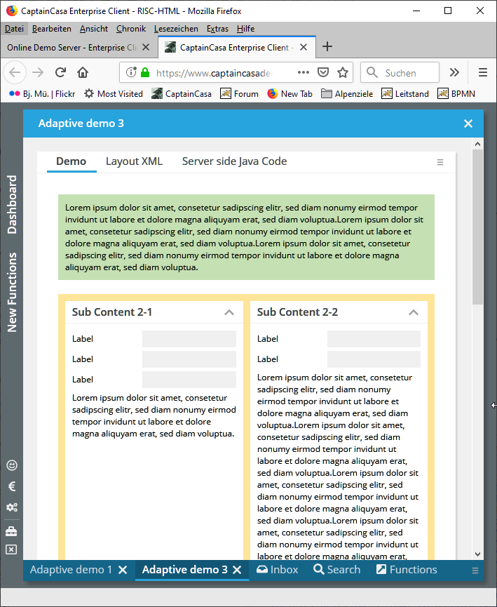
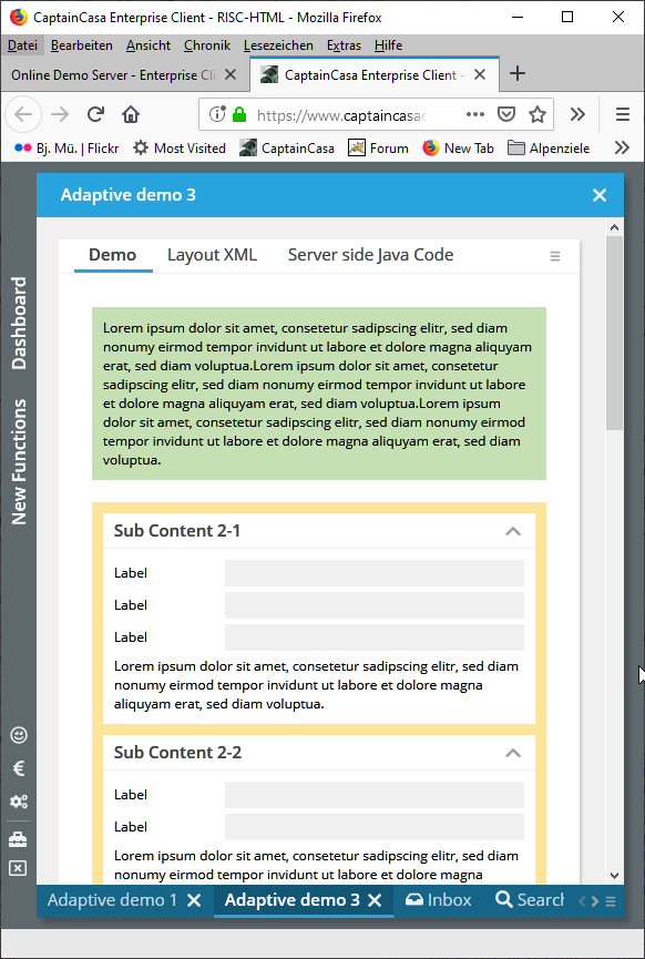
The component that is internally used is the ROWFLEXLINE component: it decides according to simple sizing rules if content components are arranged in one rows or if they are distributed to several rows. ROWFLEXLINE components can be nested – so that you have an outer ROWFLEXLINE component deciding about the “big blocks” and so that you use inner ROWFLEXLINE components to arrange the content within a block.
Please check the section “New Functions” inside the >Demo Workplace<.
